
The design of an office space goes beyond aesthetics; it plays a crucial role in shaping the environment where employees spend a significant portion of their time. One often overlooked but powerful element in office design is colour. The psychological impact of colour has been widely studied, and its influence on human behaviour, mood, and productivity is well-documented. In this article, we explore the profound effects of colour psychology in office design, specifically how it can boost morale and foster creativity among employees.
Understanding Colour Psychology
Colour psychology is the study of how colours affect human emotions, behaviour, and perceptions. Different colours evoke different emotional responses, and this understanding forms the basis for using colour intentionally in various environments, including offices.
Blue for Calm and Productivity: Blue is a colour often associated with calmness, stability, and productivity. It has a calming effect on the mind, making it an excellent choice for workspaces where focus and concentration are paramount. Additionally, blue is known to stimulate creativity, making it a versatile colour for various areas within an office.
Green for Balance and Well-being: Green is linked to nature, balance, and harmony. Incorporating shades of green in office design can create a sense of tranquility and balance, fostering an environment that supports overall well-being. This colour is particularly beneficial in spaces where employees may need to recharge, such as break areas or collaborative spaces.
Yellow for Energy and Positivity: Yellow is associated with energy, positivity, and optimism. It is a colour that can bring vibrancy to a workspace, making it an excellent choice for areas where creativity and innovation are encouraged. However, it’s essential to use yellow sparingly, as excessive exposure may lead to feelings of agitation.
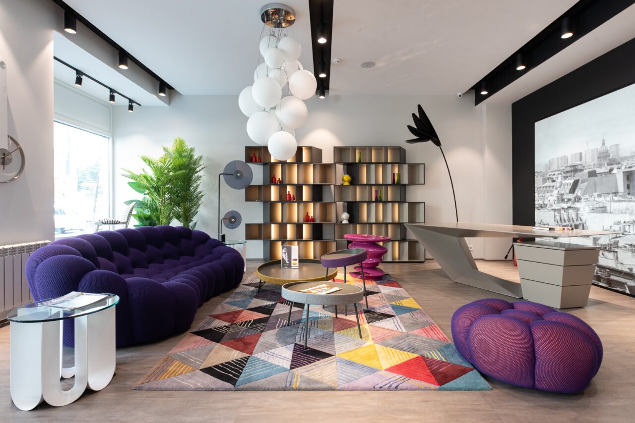
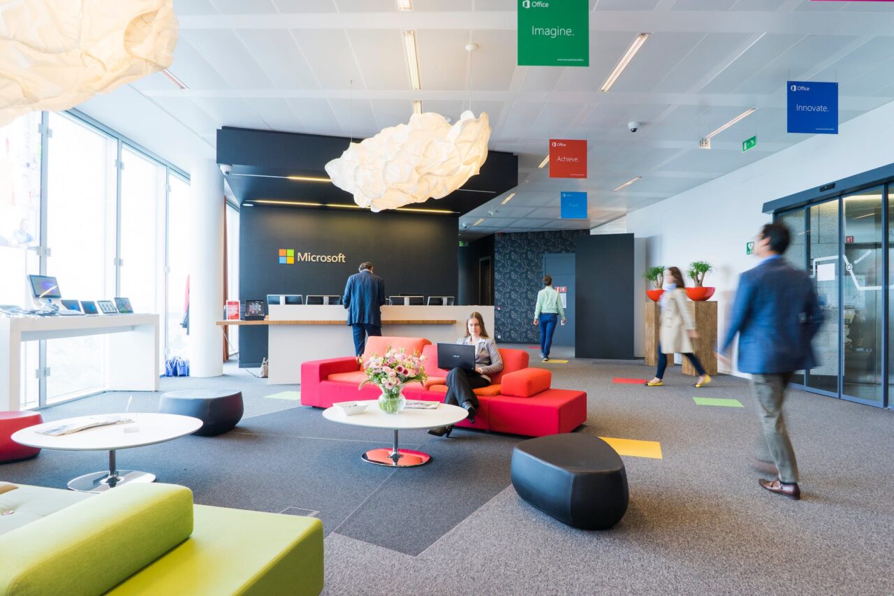
Red for Stimulating Creativity: Red is a powerful and attention-grabbing colour. It is known to stimulate the mind and increase heart rate, making it suitable for environments where physical activity and creativity are encouraged. However, due to its intensity, it’s advisable to use red as an accent colour rather than the primary colour in an office space.
Neutral Tones for Professionalism: Neutral tones such as white, grey, and beige are often associated with professionalism and cleanliness. These colours provide a clean and sophisticated backdrop, allowing other accent colours to stand out. Neutral tones are commonly used in corporate settings to create a polished and timeless look.
Boosting Morale through Colour
The colour scheme of an office can have a profound impact on the morale and well-being of employees. A thoughtfully designed space that incorporates uplifting colours can contribute to a positive and motivating work environment.
Creating a Positive Atmosphere: Colours like yellow and light blue are known to evoke positive emotions. By integrating these colours into the office design, particularly in common areas or spaces where employees gather, you can create a positive and uplifting atmosphere. This, in turn, contributes to higher morale and a more enjoyable work experience.
Easing Stress and Anxiety: Calming colours such as green and muted blues have a soothing effect, helping to alleviate stress and reduce anxiety. These colours are beneficial in areas where employees may need a moment of respite, such as break rooms or designated relaxation zones. A stress-free environment positively impacts employee well-being and overall job satisfaction.
Encouraging Team Spirit: Incorporating the company’s brand colours into the office design can foster a sense of identity and unity among employees. When employees identify with the brand colours, it can create a shared sense of purpose and teamwork, enhancing morale and camaraderie within the organisation.
Fostering Creativity through Colour

Colour psychology also plays a crucial role in unlocking creativity within the workplace. Different colours can stimulate the mind, encourage innovative thinking, and create an environment where ideas flow more freely.
Innovative Thinking with Blue and Green: Blue and green, known for their calming and balancing properties, can also stimulate creative thinking. These colours are conducive to brainstorming sessions and collaborative work where the generation of new ideas is essential. Consider incorporating these colours in meeting rooms or collaborative workspaces to enhance creative thinking.
Red for Energy and Focus: Red, with its energising effect, is ideal for areas where intense focus and creativity are required. While too much red can be overwhelming, using it strategically in spaces designed for concentrated work or problem-solving sessions can boost energy levels and stimulate creative thinking.
Balancing Neutrals with Accents: Neutral tones provide a versatile backdrop for creative spaces. To enhance creativity, consider adding pops of vibrant accent colours strategically. These accents can be introduced through furniture, artwork, or decor elements, creating a visually stimulating yet balanced environment that encourages creative expression.
Implementing Colour Psychology in Office Design
When incorporating colour psychology into office design, it’s crucial to consider the unique needs and goals of the organisation. Here are some practical tips for implementing colour psychology effectively:
Understand the Company Culture: Consider the company’s values, mission, and culture when selecting colours. The chosen colour scheme should align with the company’s identity and create a cohesive and purposeful design.
Balance Vibrancy with Neutrals: Achieve a harmonious balance by combining vibrant colours with neutral tones. This ensures that the overall design is visually appealing without becoming overwhelming.
Consider Employee Preferences: Seek feedback from employees about colour preferences and the impact of the existing colour scheme. Involving employees in the decision-making process can contribute to a more inclusive and employee-centric design.
Use Colours in Strategic Zones: Apply colours strategically based on the functions of different spaces within the office. For example, use calming colours in relaxation areas and vibrant colours in collaborative spaces.
Test and Iterate: Colours can have different effects on individuals, so it’s essential to test the impact of the chosen colour scheme and be open to adjustments. Iterative design allows for fine-tuning based on employee feedback and observed outcomes.
Colour Psychology in Office Design
Colour psychology is a powerful tool in office design, influencing the mood, morale, and creativity of employees. By understanding the psychological effects of colours and strategically incorporating them into the workplace, organisations can create environments that uplift employees, boost morale, and foster a culture of innovation. From calming blues to energising reds, the palette of possibilities is vast, offering endless opportunities to enhance the overall well-being and productivity of those who inhabit the workspace.